Client: Minnesota Association for Marriage and Family Therapy (MAMFT)
User: Minnesota Based Marriage and Family Therapists and affiliates
Tools: Sketch, Photoshop, Illustrator, Google Slides, Zoom, Otter
Process & Methodology: Heuristic Analysis with Schneiderman's Guidelines, Speak Aloud Protocol, Local and Remote Moderated Usability Tests, Affinity Diagramming
The Challenge
MAMFT has come to us to discover ways to achieve these goals more effectively by uncovering how its website can better serve its current and future user base.The Solution
By implementing several research methods, our team was able to determine that the current MAMFT website could improve their website for its user base and community by addressing problems in a few key thematic areas: Value: display “what MAMFT can do for users, Clarity: focus on clear, concise, and consistent communication and phrasing, and Usability: focus on user’s ease of navigation and interaction.
My Tasks and Roles
I conducted a solo usability review on MAMFT’s website to find opportunity areas. I then brought my findings to my team to aid our group in writing the usability test script. Our group then used this script to run several in-person usability tests on-site at Fathom consulting in their usability testing lab. We ran several sessions, and I was able to practice a role as a moderator by facilitating the usability test. I also took a position as a primary in-room note-taker and observation room observer/note-taker. Later, I independently conducted and documented three more remote usability tests. I found and scheduled an interview with a family therapist who was familiar with MAMFT, and this interview yielded great insight! Our team then extracted data from all of our interviews onto a shared board and created an affinity diagram that allowed us to discover the significant opportunity areas. Finally, on my own, I broke down this information and produced a findings and recommendations report complete with several quick high-fidelity prototype examples.
Featured Solutions and Recommendations from Report


Project Overview
Minnesota Association for Marriage and Family Therapy (MAMFT) is a non-profit that serves as the professional home for marriage and family therapists (MFTs) in Minnesota. The organization does this through engaging in advocacy (legislative and policy), providing affordable and quality training, facilitating networking opportunities, and offering other professional resources for MFTs looking to advance their practice.
Through its web presence, MAMTF is looking to better provide value, resources, encouragement, and support to its members and potential members. MAMFT has come to us to discover ways to achieve these goals more effectively by uncovering how its website can better serve its current and future user base.
Current MAMFT Website
Discovering Areas of Opportunity
By implementing several research methods, our team determined that the current MAMFT website could improve its website for its users and community by addressing problems in a few key areas of opportunity.
The first opportunity area to address is value. MAMFT would greatly benefit by addressing how they would relay their usefulness to their users. Test users unfamiliar with the organization needed help figuring out what the acronym MAMFT stood for. Additionally, most test users needed help understanding who membership was for and the benefits membership provided.
The second opportunity area to address is Clarity. All around, test users needed help understanding the wording and phrasing found across the site. In addition, test users faced large blocks of text and web pages without how-to directions.
The third opportunity area to address is Usability. Test users navigating the site often felt lost and questioned where they were or if they had already traveled to a specific part of the website. In addition, users became exhausted by repetitive forms and inconsistent navigation experiences.
Discovered Areas of Opportunity Slide from Findings and Recommendations Report
Our research team conducting a local moderated usability test at Fathom consulting.
Research
First, to gather an overview and begin collecting data on the MAMFT website, our team conducted individual heuristic analysis surveys using Scheiderman’s usability metrics as touchpoints to diagnose discovered issues. These initial surveys uncovered insight into where users may encounter navigation and task completion obstacles. Then, using our compiled data, our team formed a hypothesis that helped us create a script for our on-site and remote usability tests.
Our team traveled to Fathom Consulting to use their on-site usability testing lab. Their lab consisted of two rooms, the first room was an interview room, and the second was a mirrored dark room. In the interview room, one teammate would take the role of moderator and the other as note-taker. The remaining teammates took notes in the mirrored glass darkroom and kept track of the data points.
In total, our team interviewed five people in person and ten people remotely. Data points were extracted from the interviews and sorted using an affinity diagram. This diagram helped us organize our user experience data into categories. These categories started to show the themes or trends that became the basis for the main findings and recommendations report that we then began working on independently.
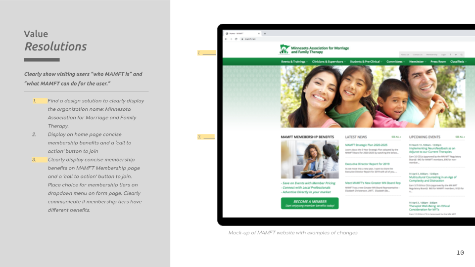
Before & After Recommended Value Changes
Findings & Recommendations
Value: We found that users needed help understanding the purpose of the MAMFT website. They had to dig around to find context for what they could do on the site. Users also found it difficult to see why they’d want to become a member or understand what “MAMFT could do for them.”
I recommended that the website clearly state what the MAMFT acronym stands for, which would help users understand the purpose of the website. This is solved by simply increasing the font size of the organization’s title displayed near the top left logo. Additionally, I suggested that MAMFT share membership benefits boldly and concisely on the home page and in-depth on the membership page.
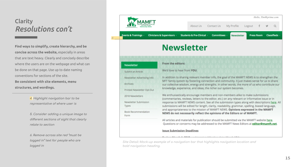
A Clarity example on the MAMFT web site that displays the same menu with unmatched elements
Clarity: Throughout the research, participants needed help understanding where they were. They often ran across large bodies of text or navigation items that were inconsistent but led the user to the same webpage. In addition, several sections of the site needed concise calls to action and more hierarchy to display the essential points or steps the user could take.
I recommended that MAMFT creates a navigational hierarchy and simplifies information across the website, especially on the word-heavy web pages. Furthermore, clearly show where the user is by highlighting navigation elements with the user’s current location. Overall, I suggest bringing consistency across the site regarding site navigational elements and menu structure.
Usability: A usability issue generally occurs when a user finds difficulty completing the task they are trying to accomplish. Several things made it difficult for the user to complete tasks efficiently on this website. Test users became distracted by the fast-moving carousel images, large intimidating forms & odd form fields, heavy text blocks, denial of outcomes, the confusing three stacked menu bars, and broken links.
I recommended that MAMFT address the abovementioned issues to help users navigate and complete tasks.
Project Reflection
Our research led us to find that the MAMFT website was challenging for its users regarding Value, Clarity, and Usability. Through our team’s research, we have been able to discover pain points and hypothesize why these pain points may cause trouble. Usability testing allowed us to test our hypotheses directly and use the insights gathered to form the basis of our recommendations and next steps. By implementing my recommended changes across its website, MAMFT will be able to create a clear, valuable, and helpful experience for its users and community.
Download Full Findings & Recommendation Report for Minnesota Association for Marriage and Family Therapy by Tim Skrivseth


