Client: Craft Notes
User: Twin Cities area craft enthusiasts
Tools: Axure, Photoshop, Illustrator
Process & Methodology: Secondary Research, Customer Journey Mapping, Annotated Prototypes

The Challenge
Craft Notes is a company that creates a passport booklet and app that gives users deals on local crafts and beer. Craft Notes was about to undergo an expensive app redesign and needed recommendations regarding where to allocate resources to create a better user experience.The Solution
Our team conducted a complete UX analysis of Craft Notes’ brand, business model, and app to find the solution. As a result, we found two key areas of opportunity that we recommended Craft Notes address over the next six months. First, we suggested that Craft Notes manage the lack of unity across the brand’s outward-facing products. Second, we recommend Craft Notes build community interaction and engagement within the mobile application.

My Tasks and Roles
I conducted secondary research to understand what other companies were doing and how we could differentiate ourselves. I also worked on building prototype designs for the main website and the app home page &navigation. As a teammate, I contributed to the group’s secondary research, the guiding strategy statement, the affinity diagram, and the customer journey map. I also supported the team by providing content for the client packet and presentation.


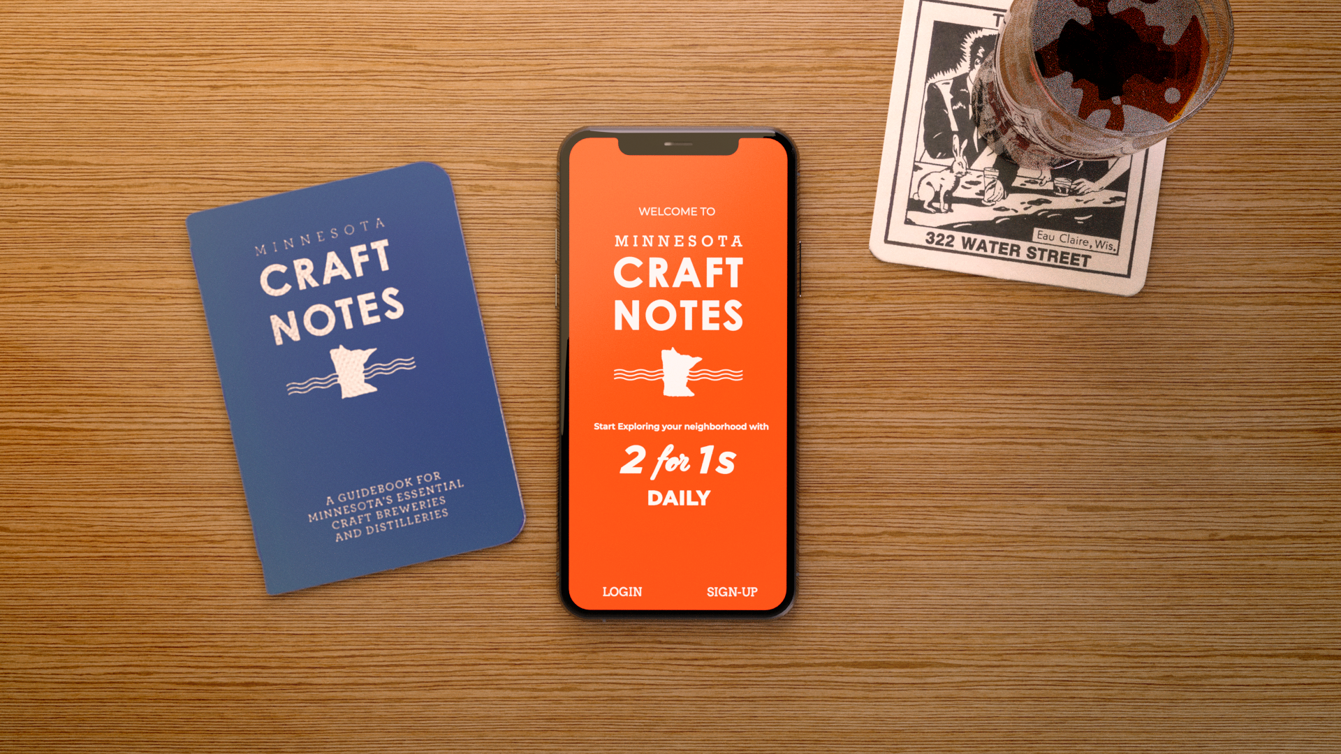
3D Render of the App Mockup Design
Detailed Project Overview
Craft Notes is a company based in the Twin Cities that publishes passport-style deal booklets. These passports allow users to easily explore the local craft scene by providing them with curated content, including great stories, art, and complimentary drinks. The passports are a novel and fun way to start exploring and connecting with the local community of craft makers and enthusiasts in the Twin Cities.
Before investing in a new overhaul of the Craft Notes mobile application, the founder of Craft Notes reached out to us and stopped to give a presentation about the product and services they provide. The founder clarified that he wanted Craft Notes to be the go-to medium for users to find and explore the best the local craft community has to offer. In addition, he wanted his users to be engaged in the application to support and build a local community around the craft makers themselves. Finally, the founder also wanted general feedback from a user experience perspective.

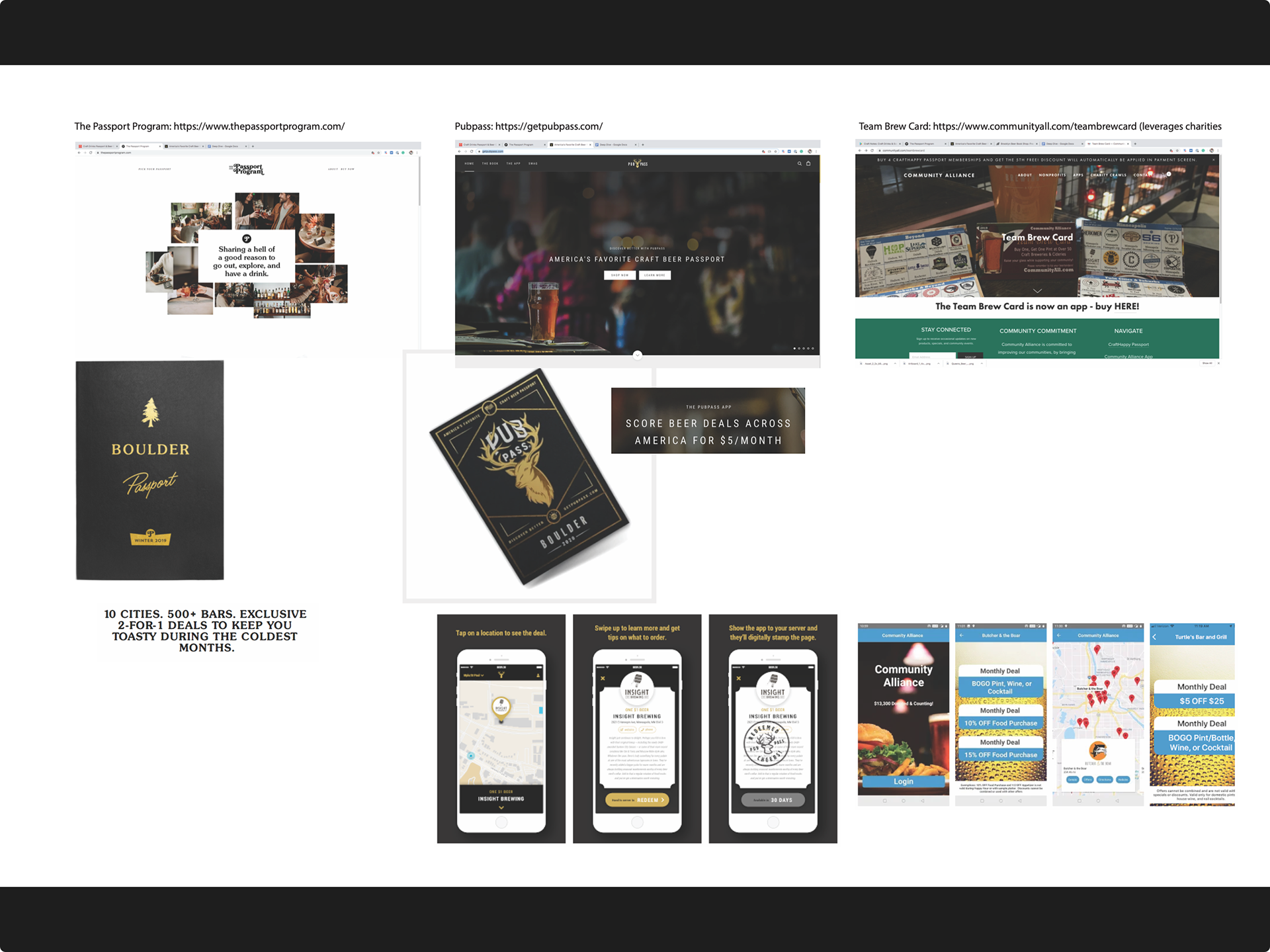
We started by looking at Craft Note’s business website and reading through its about page, mission statement, and FAQs. We also looked at their social media presence and analyzed any user reviews. We then took a look at the competitive landscape. Our team looked at other apps and businesses across the country that offer similar experiences and analyzed their feature sets, designs, and user reviews.
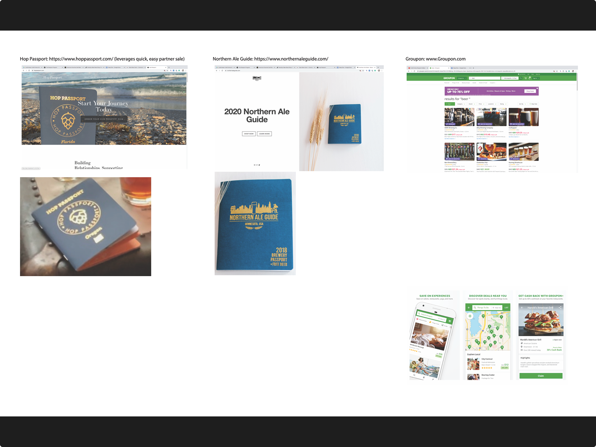
My secondary research focused on comparing Craft Note’s visual brand identity to other competitors in the space. To compare the different companies, I placed the examples in a table-like layout (right/below). I then added notes to the document to call out key insights, which would later aid in relaying my findings to my teammates.

Brand Visual Comparison 1
Brand Visual Comparison 2
Brand Visual Comparison 3
Comparing Craft Notes to competitors, I discovered the following two key takeaways:
1. Competitors had established consistent visual branding across user interaction touchpoints.
2. Competitors generally used the same form factor for the drink passport but differentiated themselves with solid branding.

After we finished our independent research, our team came back together to synthesize and share our data on a whiteboard. First, we briefly presented our key findings and displayed our examples. Then, we created categories to sort out our key insights. Then with a high-level overview, we compared what we had found in the competitive space to Craft Notes to discover any overlooked areas of opportunity.
The high-level overview helped us see and collect insights from each team member’s research focus area. Our team found many areas of opportunity, but we still needed to find out which would make the most significant impact if changed. To help us narrow our scope, we set up a constraint by creating a user journey map. Beginning this journey map helped our team understand how customers interact with Craft Notes and identify areas where the customer experience could be improved.
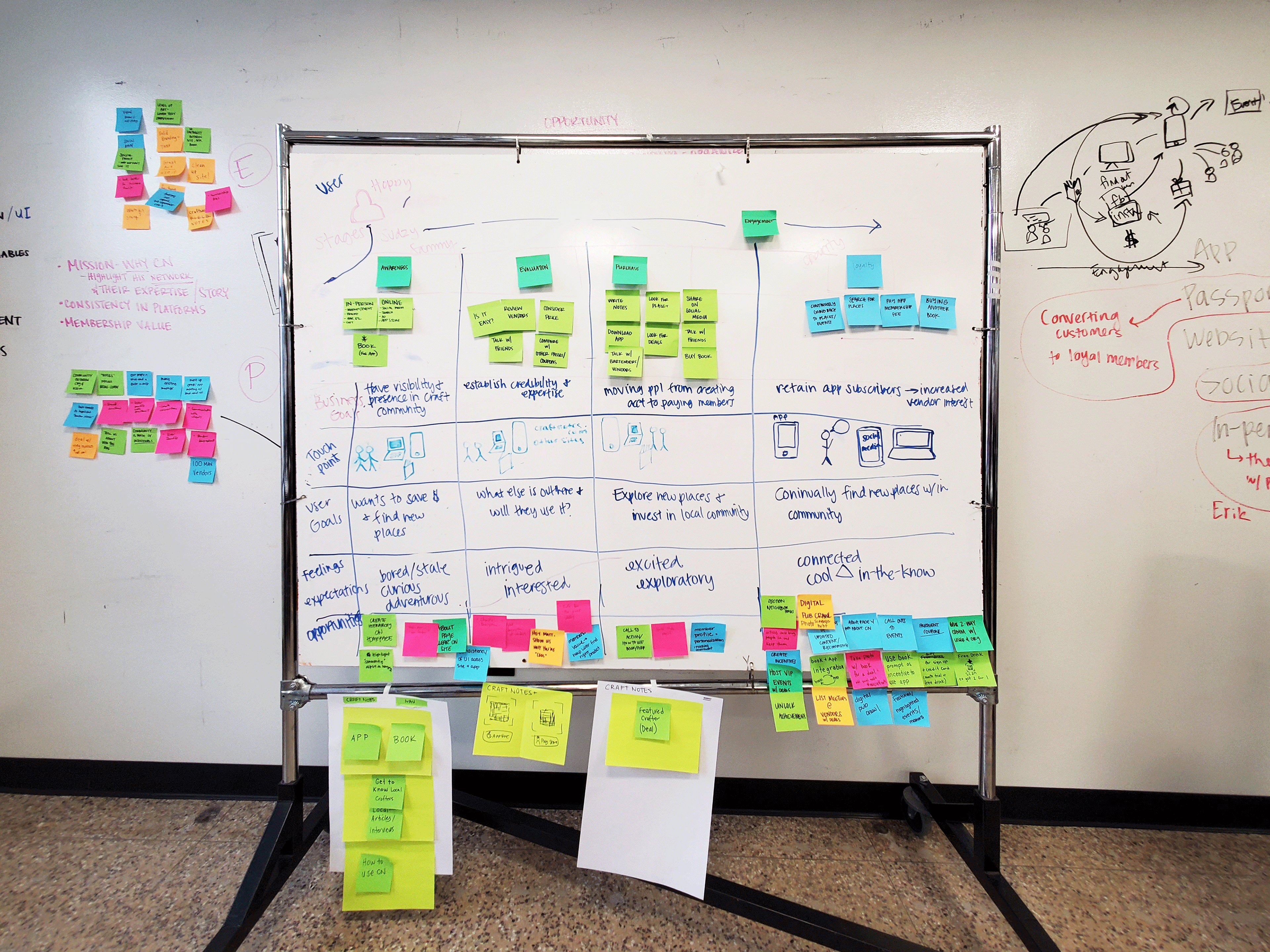
Journey Map Work Board
As a team, we agreed that Craft Notes could make the most impact by focusing on the following for the next six months:
1. Build trust in the brand: focus on creating a consistent brand narrative with brand visual style, overall message, and experience between the passport book, website, and app.
2. Build community interaction in the app with new features that aim to connect, personalize, game, donate, reflect, and share.

Prototyping Solutions for the Key Opportunity Areas
Our team split up work to begin the prototyping phase of the project.
For my work, I continued by addressing the visual brand identity. At the time, Craft Note’s had various styles deployed across its business presence. This visual incongruence was confusing; therefore, I made it my goal to bring visual conformity to the brand.
For my work, I continued by addressing the visual brand identity. At the time, Craft Note’s had various styles deployed across its business presence. This visual incongruence was confusing; therefore, I made it my goal to bring visual conformity to the brand.
The Craft Note’s passport book was the most recognizable and successful item. Therefore, I used the passport to inform the design of the other touch points. I began by redesigning the mobile onboarding screen to match the passport and added some branding language. Later with some adjusting, my other teammates used this login screen template as a base to prototype other featured solutions, which helped keep our outputs cohesive.
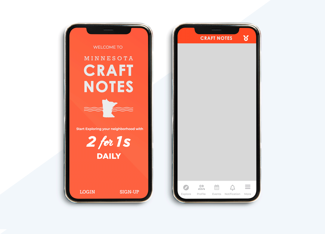
Onboarding and App Interface Templates


Website Prototype
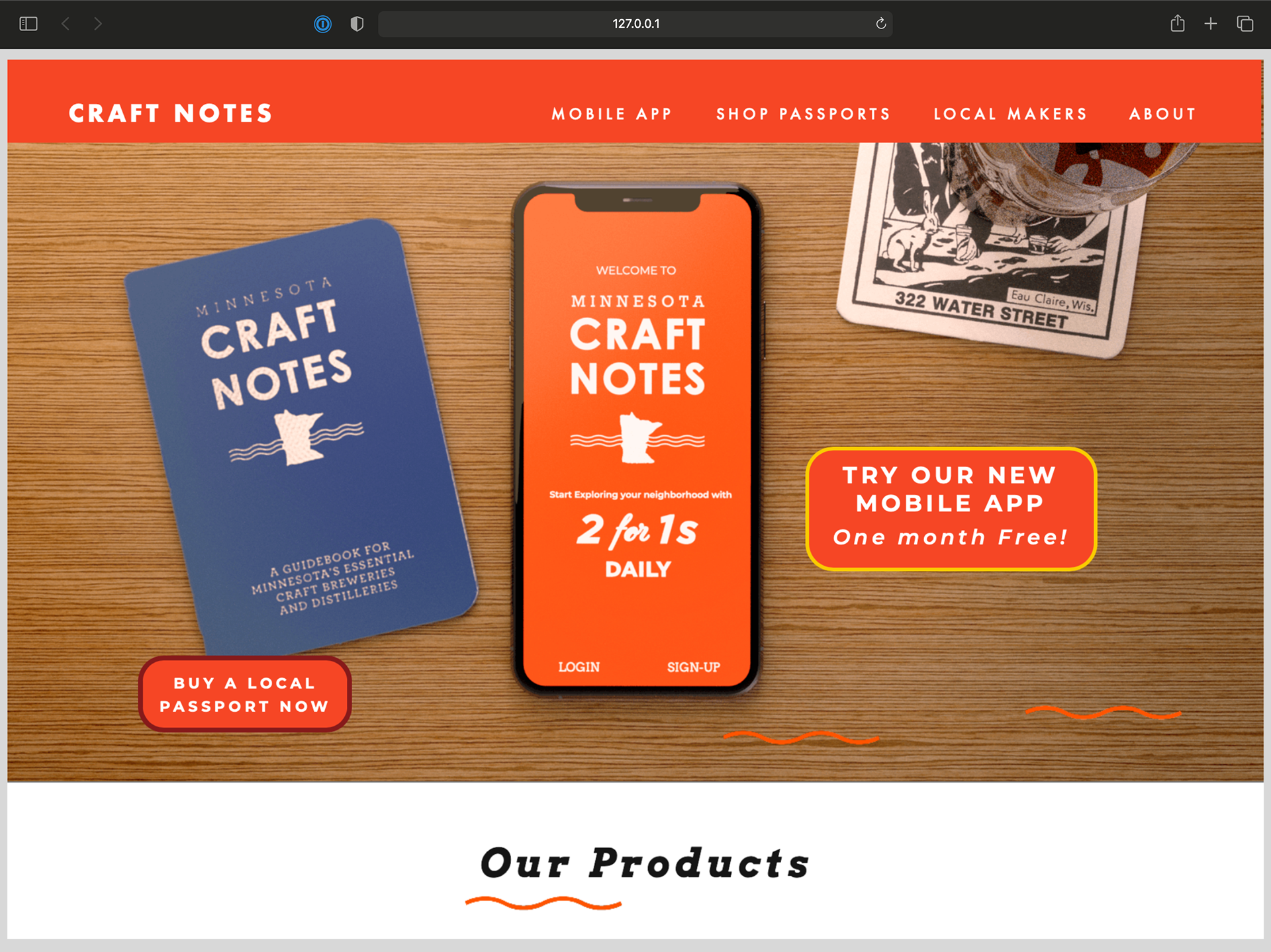
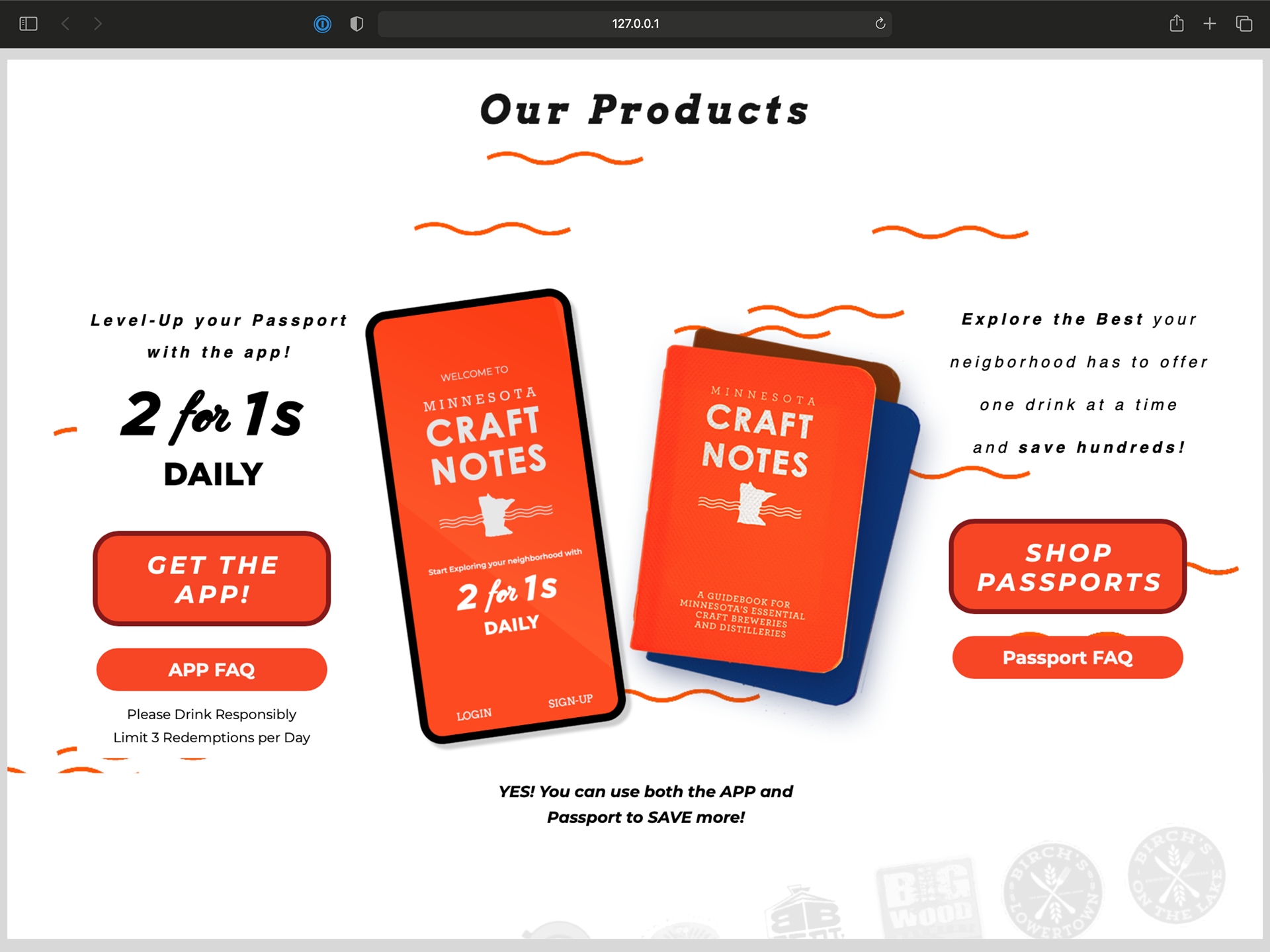
Next, I began to work on the main website design. My goal for the website was to simplify the overwhelming amount of information displayed by its card-style template and create brand conformity. The unsortable card-style template Craft Notes used was challenging to navigate and hard to understand for the user. To combat this, I first set up a static header that followed the user across the site navigation. I then began designing the homepage by creating distinct sections with a hierarchy to highlight the user call-to-action elements.
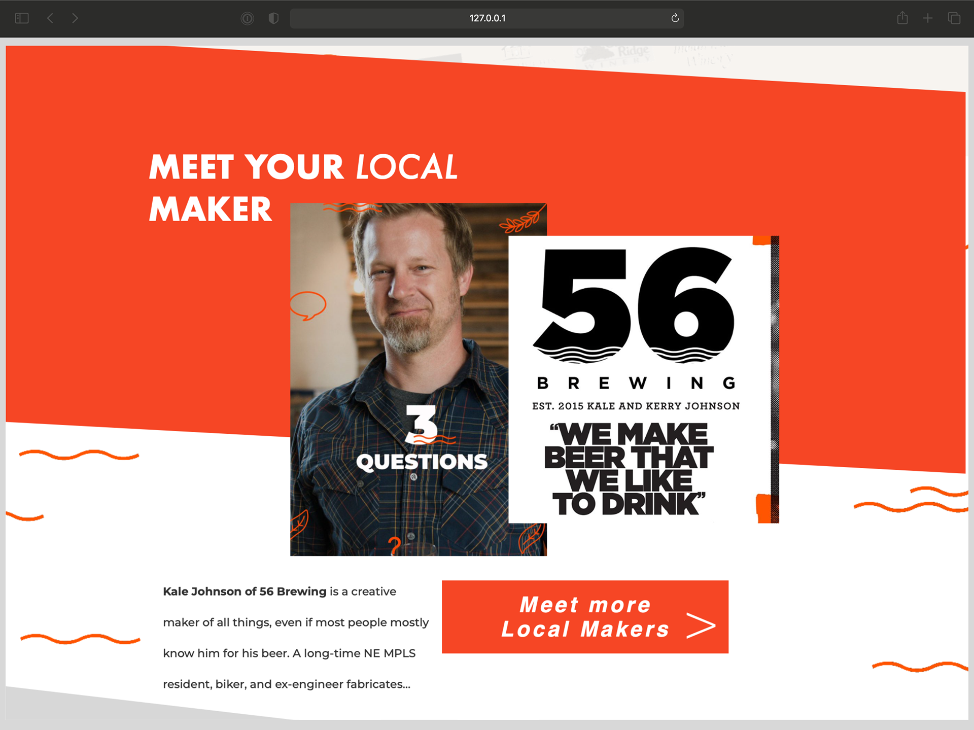
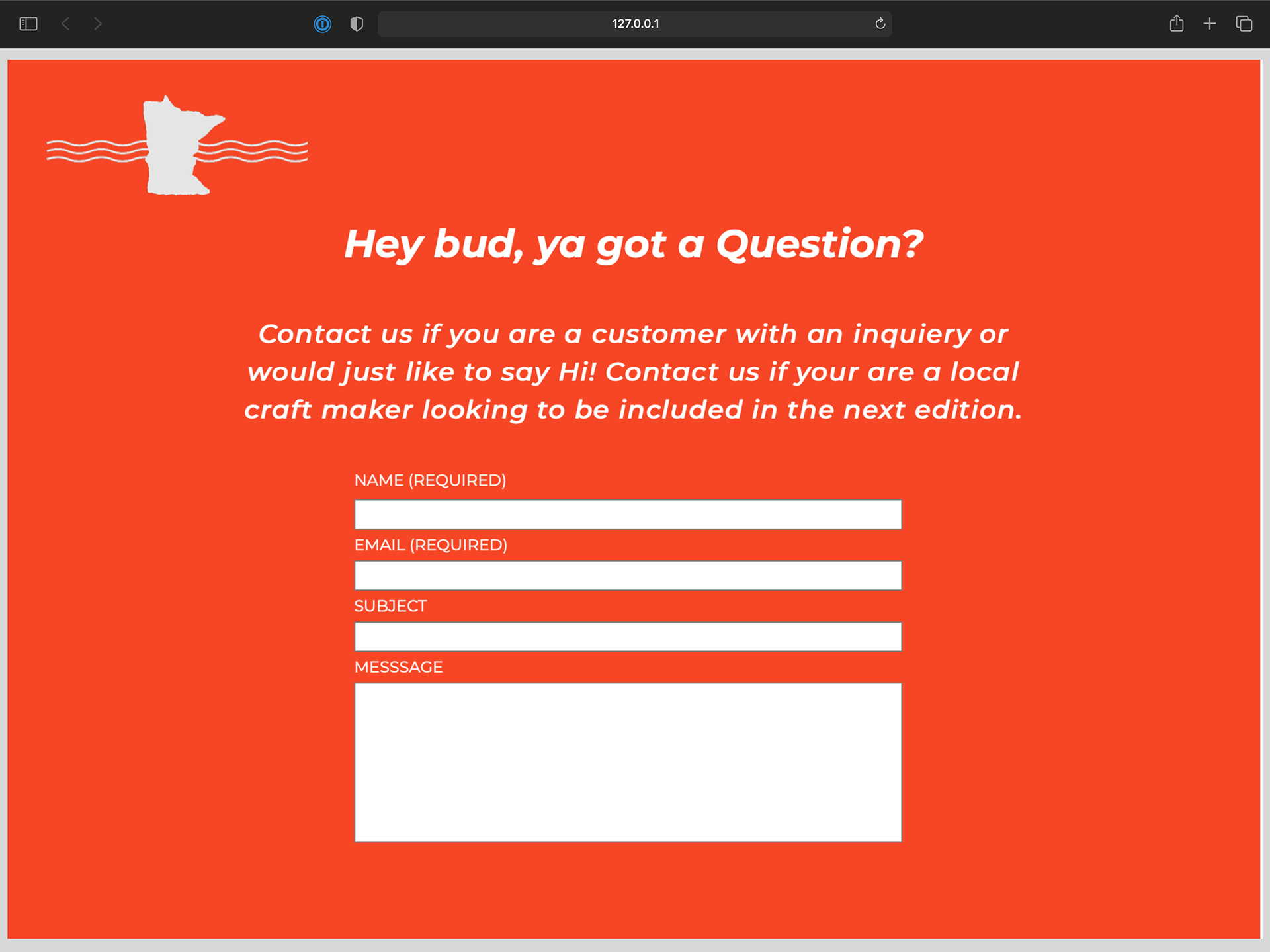
From top to bottom, I made a section for shopping & info on products, exploring partners, blog highlights of local makers, brand information, and an area for direct feedback. Each new section gave the user clear call-to-action steps while following an easy-to-understand linear path. Finally, I rejoined the team, helped create the Annotated Prototype Package, and took on several roles in creating the interactive video tour.
From top to bottom, I made a section for shopping & info on products, exploring partners, blog highlights of local makers, brand information, and an area for direct feedback. Each new section gave the user clear call-to-action steps while following an easy-to-understand linear path. Finally, I rejoined the team, helped create the Annotated Prototype Package, and took on several roles in creating the interactive video tour.
Craft Notes Interactive Video Tour

Project Reflection
The Craft Notes project was a great UX design sprint learning experience. As a team, we discovered many essential opportunity areas and had to figure out the most important things to work on in the time given. Our team didn’t have established roles, but I learned that there are times when all team member input is valuable and times when it is not. To our credit, we accomplished a lot in the time we were given. However, if I were to take on another project like this again, it would better serve the team to take more time to outline the main high-level objectives and tackle them first. Then, if possible, address any secondary objectives within the time permitted.